User Experience Designer
Open to work
Making digital experiences simpler, clearer, and easier to use.
Explore my workGet in touchFeatured Projects
Services
I design intuitive digital products that balance user needs, business goals, and functional simplicity.
I design web and mobile experiences that turn ideas into easy-to-use products, using wireframes, prototypes, and reusable design components to create consistent experiences that meet users' needs and product goals.
I explore what people need, where they struggle, and what matters most to them, using research and user feedback to identify problems and guide design decisions that make products more useful.
I create clean, engaging interfaces and thoughtful interactions that help people navigate digital products with ease, making every screen clear, every action intuitive, and every experience consistent.
Featured Projects

More designs
 AZZA
 VIBE+
 LUMINO

User Experience Designer
About
I'm Abdur-Rasheed Ariyibi, a User Experience Designer focused on creating digital products that are clear, useful and built around real user needs. My work sits between understanding the problem, making sense of what users need, and turning those insights into practical product experiences.
My background is rooted in the social sciences, which has shaped how I approach design. Studying people, behavior, culture and social patterns gives me an edge and makes me see beyond the interface and ask why people behave the way they do. That perspective has become useful in my approach to user research, usability testing and understanding different user needs.
My experience spans EdTech, fintech, SaaS, and community-driven products and my work spans product thinking, user experience, interface design and interaction design. I enjoy breaking down complex problems, exploring different approaches, and refining ideas into experiences that feel clear and natural to use.
Whether I'm joining a product team or working directly with a client, I bring the same zeal and approach, which focuses on understanding the problem, designing with purpose and continuing to improve until the experience makes sense.
As I continue to grow as a designer, I'm interested in accessibility, inclusive design, and the role technology can play in making essential digital services easier for people to use.
Beyond design, I like watching movies, playing games, drawing, listening to music and reading. Blending work and creativity with play helps freshen my mind and perspective which in turn influences how I approach design, and more importantly, it makes me feel alive and keep my inner child happy.
My Tools
 FigmaUX Design
 WebflowNo-Code Development
 NotionDocumentation
 ClaudeAI Collaborator
Experience
Want the full picture?
See education, certifications, and full work history.
A few other things

Resume
Experience at a glance
User experience designer with hands-on experience across user research, product thinking and strategy, wireframing, prototyping, usability testing and iteration.
Download full CV (PDF)Product Designer (Volunteer), Learn2Farm
Dec 2024 to Sep 2025. Collaborated with a multidisciplinary team to shape an agricultural education platform that makes practical farming knowledge more accessible to learners through digital learning experiences.
IT Intern, UBEC Digital Resource Centre
Aug 2023 to Nov 2024. Contributed to digital education initiatives that advanced smart learning in Nigeria, supporting efforts to strengthen teachers’ digital literacy and expand the use of technology in basic education.
Data Visualization Associate Intern, Excelerate (Remote)
Sep 2024. Contributed to data-informed programme decisions by transforming complex data into actionable visual insights and coordinating a team of six interns to deliver data visualisation projects.
Education and certifications
- B.Sc. Sociology, Federal University of Lafia (2023)
- Google Career Certificate, Foundations of User Experience Design (2025)
- Diploma in Desktop Publishing, Lekmosh Technologies Limited (2015)
Open to work
Let's talk
Open to full-time roles and freelance projects. Reach out directly, or send a message below.
Send a message
AjoHub
A trust-based savings app that helps Nigerian communities save together, digitally.
Don't just look, click through it: open the AjoHub prototype ↗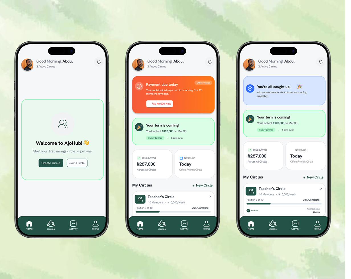
Overview
AjoHub digitizes traditional Nigerian rotating savings groups (Ajo/Esusu), where members pool money together and take turns collecting the full pot. The goal was to preserve the social, trust-based spirit of the tradition while solving the structural problems that have made it fragile at scale.
The problem
Rotating savings circles, Ajo in Yoruba, Esusu in Igbo, are a culturally significant and financially effective way many Nigerians save. But the traditional system has real cracks:
Fragmented financial experience
Savings management is disjointed across groups, with no unified way to track them.
Lack of payment transparency
No reliable way to verify who has paid and when.
Position assignment disputes
Disagreements over collection order.
Administrative burden
Coordinators manually track records, collections, and payouts.
Limited reach and accessibility
Restricted to people within physical or social proximity.
No digital trust infrastructure
Existing platforms lack the accountability features financial communities actually need.
Research & personas
I ran the entire process solo, concept, research, UX, and UI, grounding the design in four personas that capture the range of real Ajo participants.

Coordinator
Chioma
32, Lagos · Teacher
Pain: Tired of chasing members on WhatsApp
Goal: Automate reminders and tracking
"I just want everyone to pay on time so I can focus on my own life."

Reliable member
Tunde
28, Abuja · IT Professional
Pain: Past coordinator mismanaged funds
Goal: Full transaction transparency
"I don't mind paying, I just need to trust the system."

Family Circle Manager
Aisha
29, Port Harcourt · HR Manager
Pain: Manages 2 family circles (15 people); spends hours tracking, reminding, and mediating disputes
Goal: Automated payment tracking and a clear audit trail
"I want to focus on keeping the group happy, not chasing payments."

New Coordinator
Collins
28, Abuja FCT · Marketing Manager
Pain: Excel sheets confuse non-technical members; no proof of who contributed what
Goal: A transparent circle with automated reminders and a real-time payment dashboard
"I want something so transparent that nobody would doubt my integrity."
Design principles
Trust is everything
Transparent transactions with no hidden fees, visible verification badges, and a dispute process shown upfront.
Social first
Group dynamics preserved, not flattened into a transaction log, warm messaging, milestone celebrations.
Simple, not simplified
The interface stays clean while still handling real complexity, late payments, disputes, edge cases.
Inclusive design
Works on low-end Android phones, with a USSD fallback and progressively-loading, data-light visuals.
Nigerian context, baked in
English, Pidgin, Yoruba, Igbo, Hausa; Naira throughout; bank transfer, USSD, Paystack, Flutterwave.
User journeys
Creating a group (coordinator)
- 1.Sign up & verify phone/BVN
- 2.Create group, name, amount, frequency, duration
- 3.Invite members via shareable link
- 4.Members verify identity
- 5.Set collection order (random, fixed, or auction)
- 6.Cycle starts with automated reminders
- 7.Real-time payment tracking
- 8.Auto-transfer on collection day
- 9.Cycle repeats until everyone has collected
Joining a group (member)
- 1.Open invite link
- 2.Sign up & verify identity
- 3.Review group terms
- 4.Accept & join
- 5.Link payment method
- 6.Get reminders and pay in-app
- 7.Track who's paid and who's next
- 8.Receive funds on your turn
- 9.Rate members at cycle's end
Handling disputes
- 1.Missed payment triggers a coordinator alert
- 2.Coordinator reaches out directly
- 3.No payment within 48 hours → group votes to skip or wait
- 4.Skipped member loses their turn (risks a ban)
- 5.Unresolved cases escalate to in-app mediation or refund
Key screens
Grouped by the flow each screen belongs to, rather than a flat gallery.
Getting started
First-time experience, from opening the app to telling us what they're saving for.
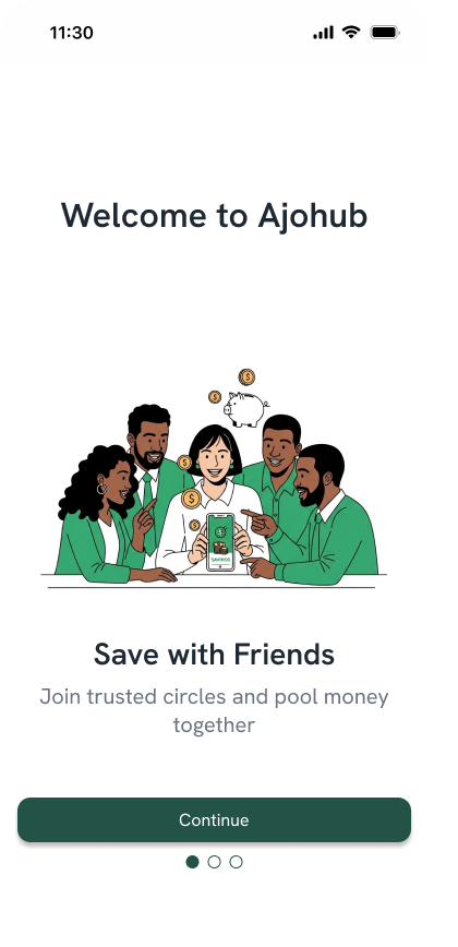
Onboarding
Leads with the social angle before anything transactional.
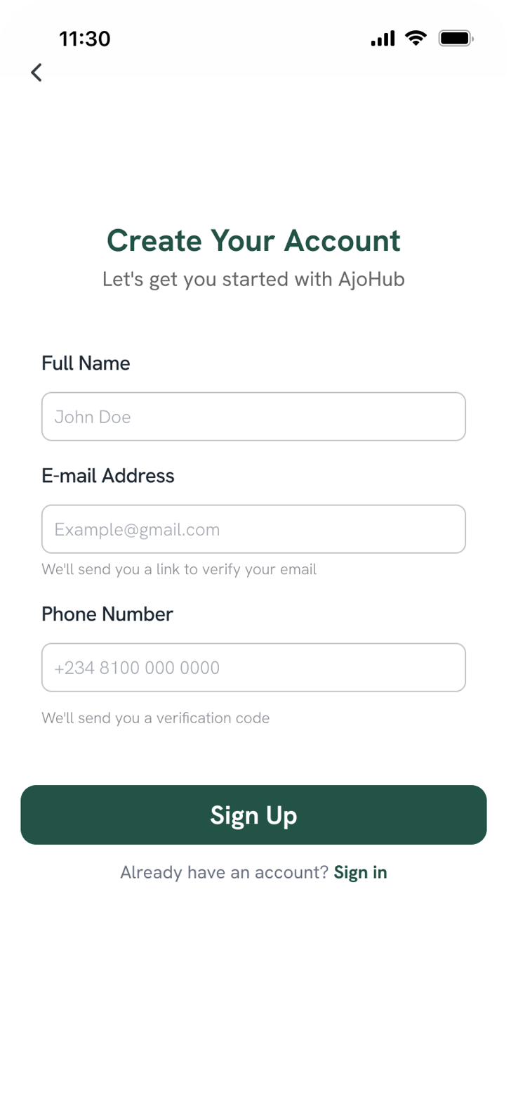
Sign up
Phone + email verification builds the trust layer from step one.
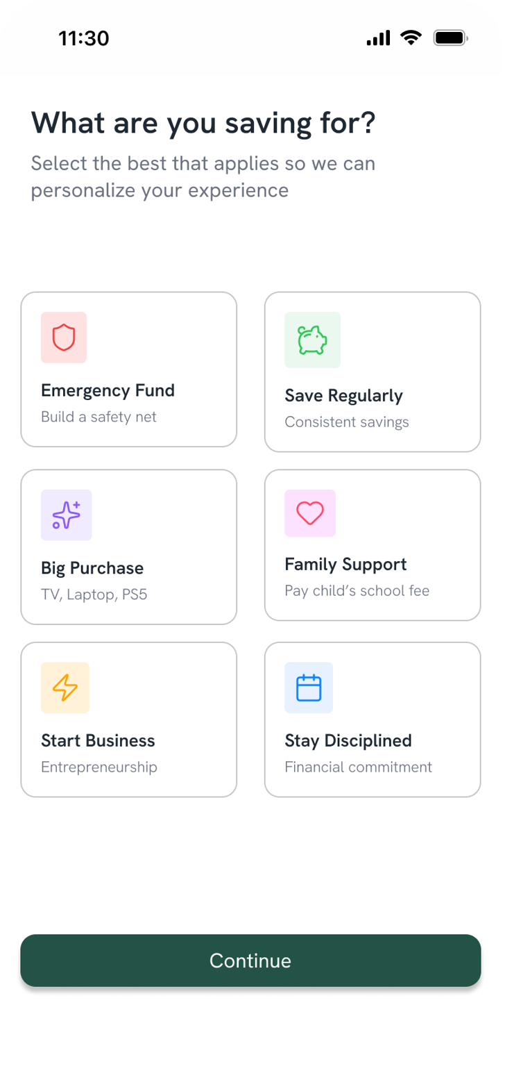
What are you saving for?
Personalizes the experience early by capturing intent.
Creating a circle
The coordinator path, setting terms and bringing people in.
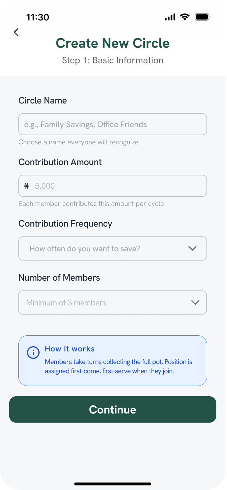
Create a circle
Coordinators set contribution amount, frequency, and member count.
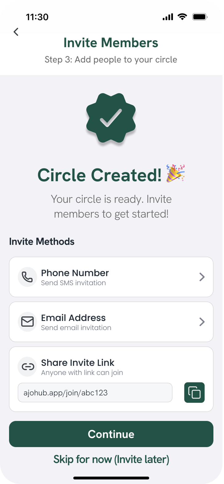
Invite members
Three invite paths, phone, email, or a shareable link.
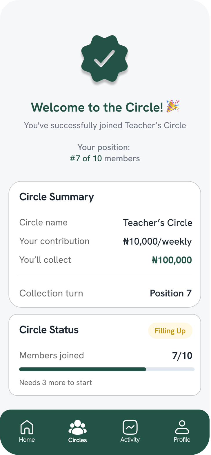
Circle created
Immediate confirmation with the invite link ready to share.
Managing circles
The three states every member moves between: active, discovering, and completed.
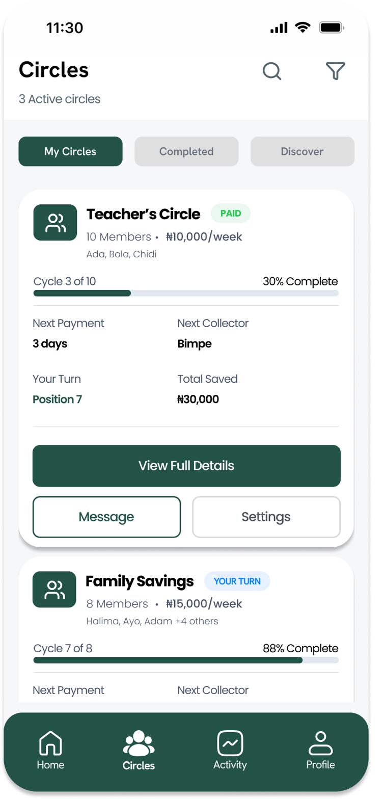
My circles
Active circles with real-time cycle progress, visible at a glance.
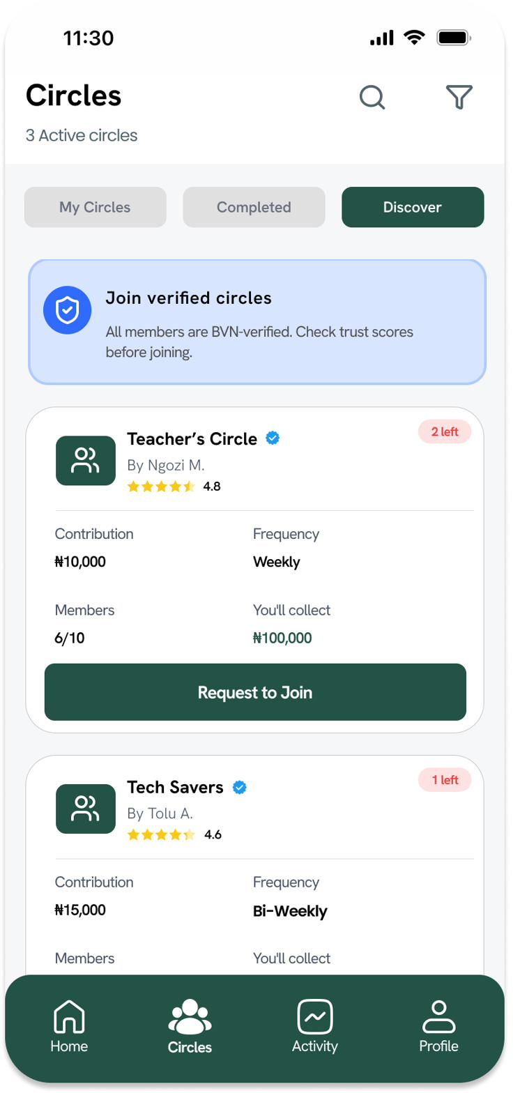
Discover
Verified circles with trust scores, so joining strangers doesn't feel risky.
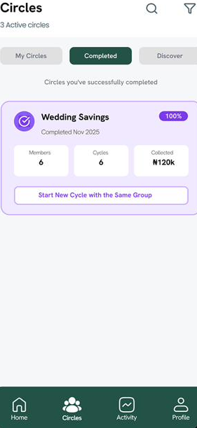
Completed
A dedicated home for finished cycles, with a one-tap restart option.
Paying & staying connected
Where trust is either earned or lost, transparent payments and a living group chat.
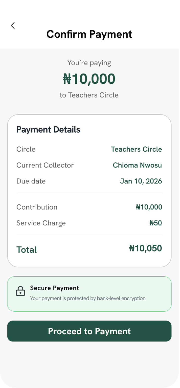
Confirm payment
Full transparency on contribution vs. service charge before money moves.
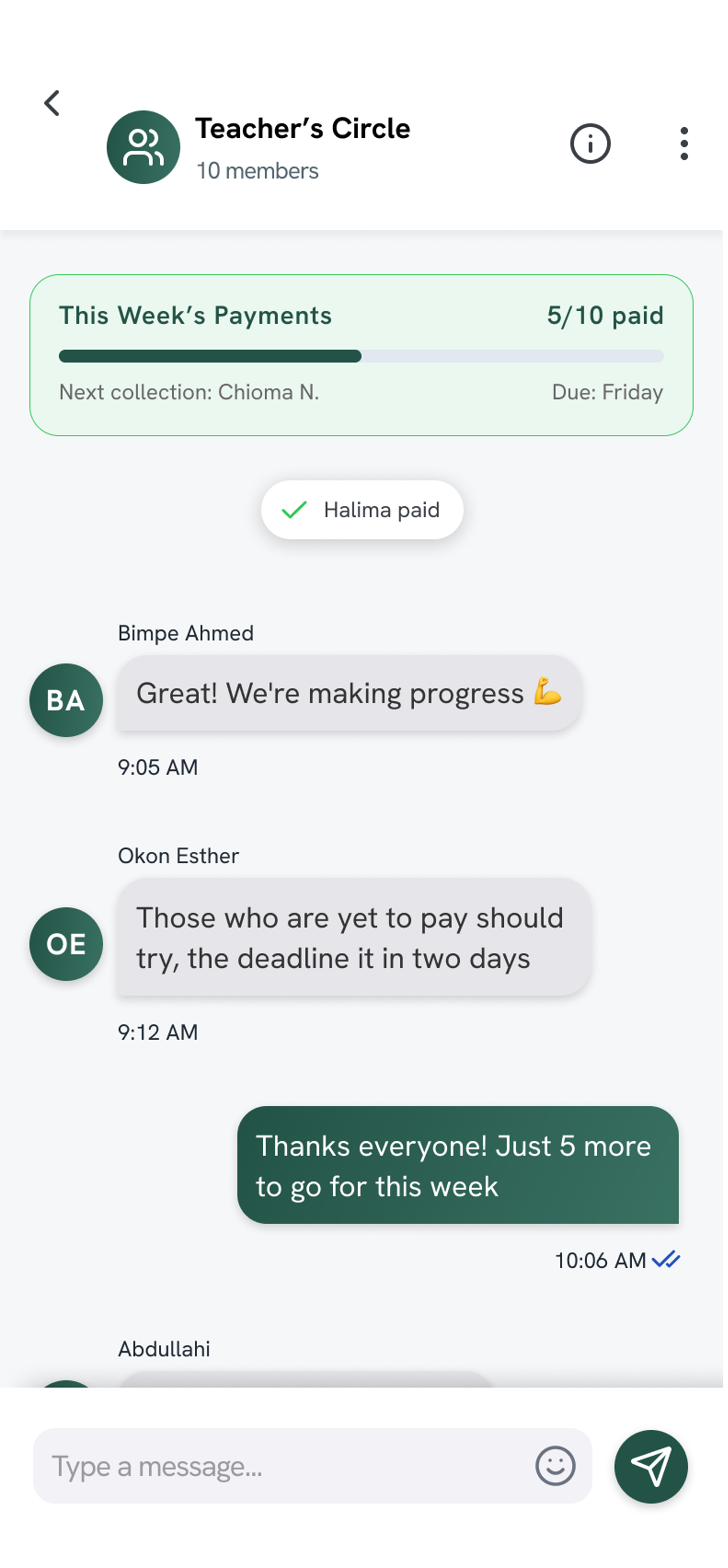
Group chat
Payment status and conversation live side by side.
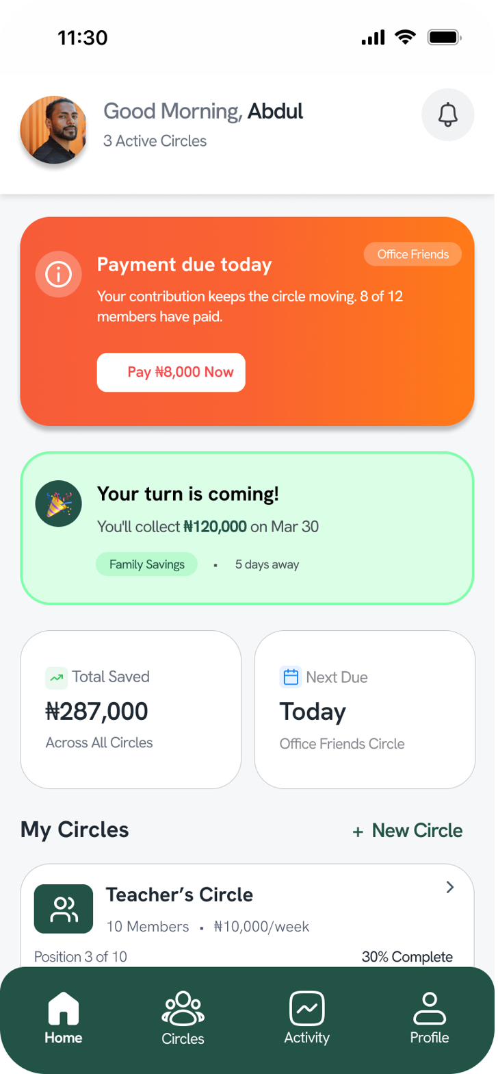
Home dashboard
Surfaces what matters most: payment due today, and an upcoming payout.
Outcome
A functional savings app that lets communities run Ajo and Esusu circles digitally. Users can sign up with phone and email verification, create a circle by setting the contribution amount, frequency and member count, and invite people by phone, email or a shareable link. They can discover verified circles by trust score, confirm each payment with a clear breakdown of contribution and service charge, follow payment status in a group chat, and see what is due today and when their payout arrives, all from one home dashboard.
Try it yourself: open the AjoHub prototype ↗Pet Care
A pet health & clinic appointment management app.
Don't just look, click through it: open the Pet Care prototype ↗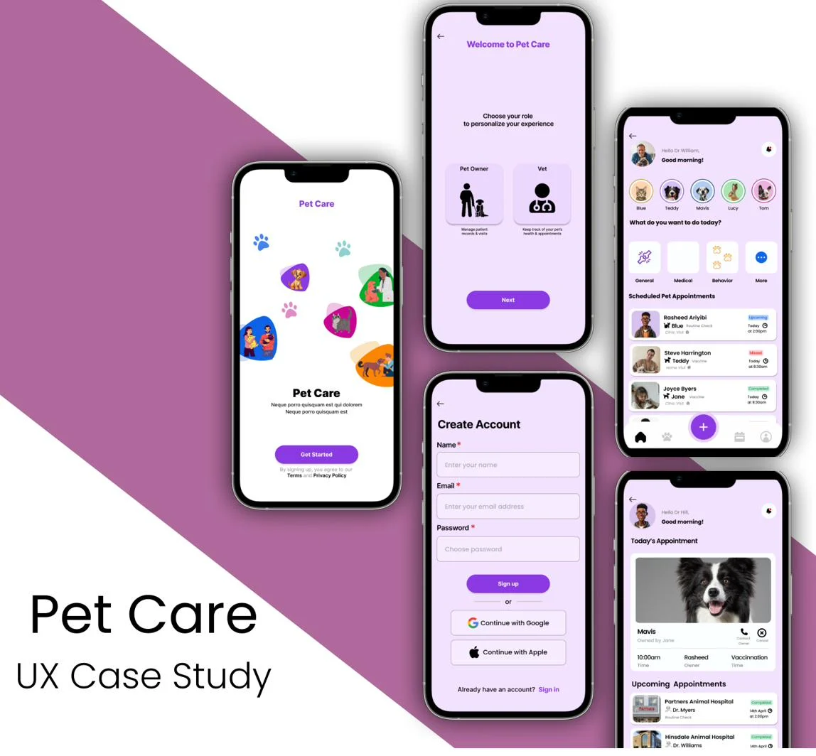
Overview
Pet Care is a mobile app concept designed to connect veterinarians and pet owners through one unified, intuitive platform. Owners can schedule appointments, track health records, get vaccination reminders, and manage multiple pets in one place, while vets get a centralized system to view profiles, update records, and streamline clinic communication. This project was completely self-initiated.
My role
This was a self-initiated concept project, not a formal job role or client engagement. I handled the full end-to-end process myself: user research, problem definition, user flows, wireframing (paper + digital), high-fidelity UI design, prototyping in Figma, basic usability testing, accessibility considerations, and design iteration.
The problem
Both veterinarians and pet owners struggle with fragmented, inefficient health management systems, leading to missed appointments, poor health tracking, and difficulty syncing information between both sides.
No unified platform for vets
Veterinarians lack a single place to manage pet records, appointments, and communication.
Owners forget key health dates
Vaccination schedules, upcoming appointments, and health updates slip through the cracks.
Multi-pet management is confusing
Owners with more than one pet have no central system to keep track of each one.
Project goals
- 1.Create a unified digital platform for managing pet health records.
- 2.Provide reminders and real-time updates for vaccinations and treatments.
- 3.Simplify appointment scheduling for both pet owners and vets.
Target users
Pet Owners
Want to easily access health information, track vaccinations, book appointments, and manage multiple pets.
Veterinarians
Need a structured system to view medical histories, manage appointments, and update treatments.
Design process
I followed the Google Design Thinking framework, Empathize → Define → Ideate → Prototype → Test, to create a practical, user-centered solution for pet owners and veterinarians.
I began by exploring how people currently manage pet health, speaking with a small group of pet owners and reviewing how clinics handle appointments and records. These findings surfaced common challenges, missed vaccinations, unorganized records, scheduling friction, which shaped four user personas representing different types of users, from busy professionals to veterinary staff.
From there I mapped user flows, sketched early wireframes, and refined them into high-fidelity designs in Figma. After building an interactive prototype, I ran basic usability testing on core features, appointment booking, managing multiple pets, and accessing health summaries, incorporating accessibility considerations like readable typography and clear visual hierarchy throughout.
Research & personas
Four personas grounded the design in real, distinct needs.

Pet Owner
Sarah Johnson
32, Marketing Executive · Urban City · 2 dogs (Luna and Max)
Pain: A full-time job and a hectic schedule make it hard to keep track of vet appointments, vaccinations and health notes for two dogs, which she currently logs by hand in a notes app.
Goal: One convenient mobile place that keeps everything together, books visits without phone calls and syncs directly with her veterinarians.

Pet Owner
Wyatt Langmore
22, Student · Urban Area · 1 puppy (Max)
Pain: Juggling classes, assignments and part-time work, he forgets vet appointments and finds it stressful to search for clinics and learn proper puppy care.
Goal: To be a responsible first-time owner with an intuitive, fast and organised app that finds trusted clinics nearby and tracks vaccinations.

Veterinarian
Dr. Amina Muhammed
34, Veterinarian · Urban Area · 1 cat (Luna)
Pain: Long shifts and many daily patients leave little time. Owners forget visits, records sit across sheets, files and WhatsApp, and reminders are sent by hand.
Goal: Digital tools that keep her organised, give quick access to accurate pet histories and make communication with owners efficient.

Clinic Owner
Dr. Michael Burrows
45, Veterinarian and Clinic Owner · Suburban Area · No pets
Pain: Runs a small but busy clinic and loses time to paperwork, lost paper records, appointment overlaps and inconsistent communication with owners.
Goal: A reliable system to manage appointments, view pet histories in one place and cut the clinic's admin workload.
Key screens
Grouped by the flow each screen belongs to.
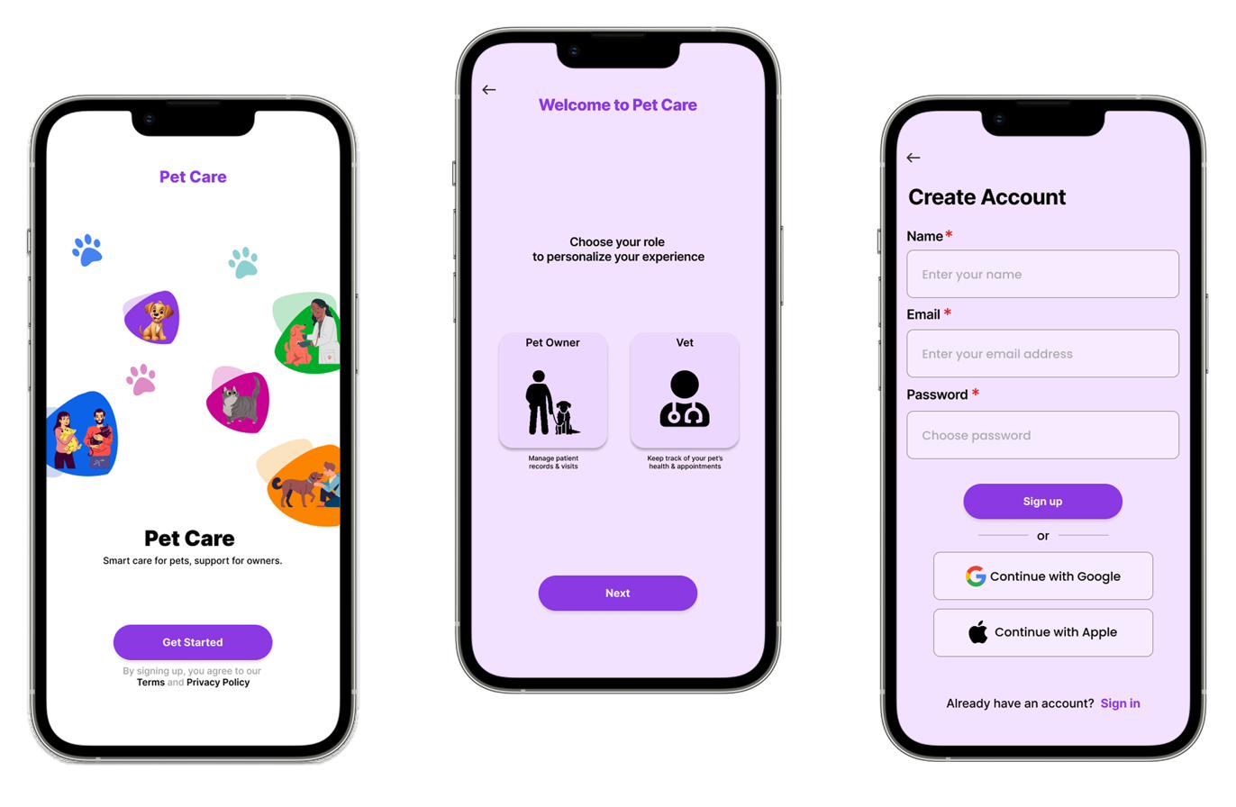
Getting started
Onboarding and account creation for a new user.
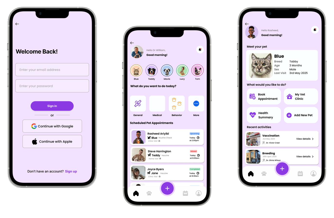
Home experience, both sides
Sign-in, plus tailored home screens for vets managing patients and owners managing pets.
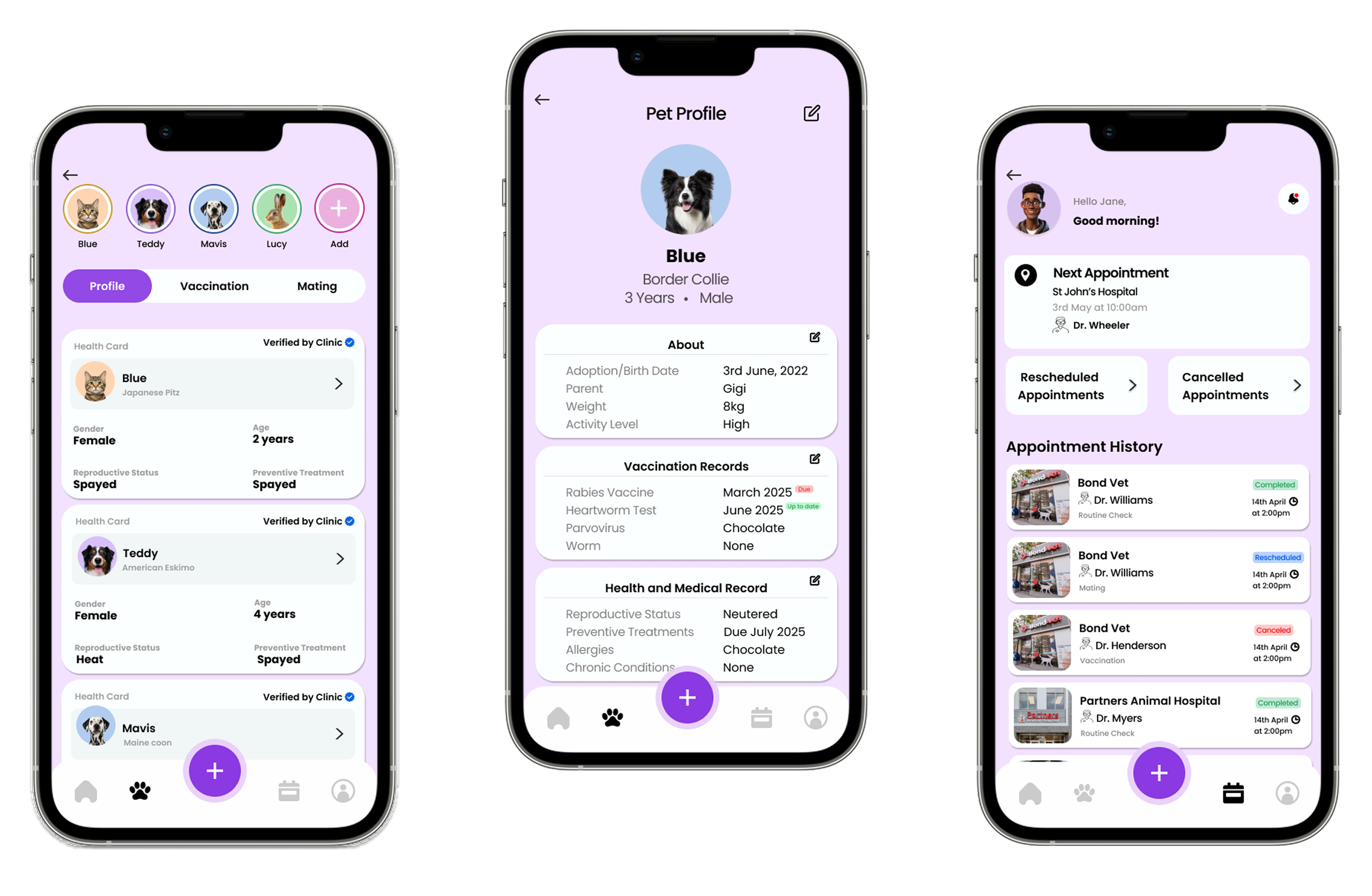
Pet health records
Multi-pet lists, a full pet profile with vaccination history, and a vet-side appointment history.
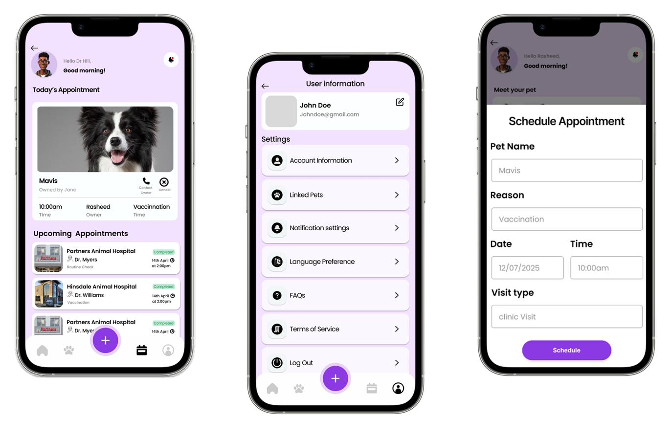
Scheduling & settings
Today's appointments, account settings, and the appointment-booking form.
Outcome
A functional pet health app that brings owners and vets onto one platform. Owners can create an account, manage multiple pets, view each pet's profile and vaccination history, and book vet appointments. Vets get a tailored home screen to manage patients, see today's appointments and review appointment history.
Try it yourself: open the Pet Care prototype ↗Learn2Farm
A digital learning platform that turns agricultural training into real farm businesses for youths.
See it live: visit learn2farm.org ↗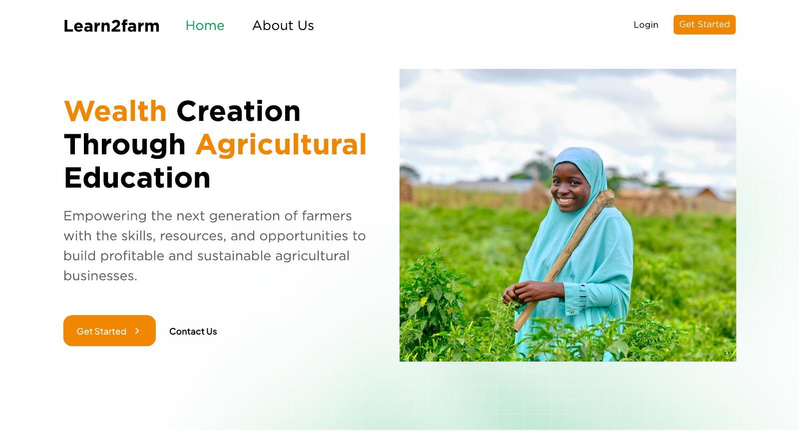
Overview
Learn2Farm makes agricultural skills reachable for youths, unemployed people, civil servants and a curious population looking to invest in and learn about agriculture. It pairs online courses with on-the-farm experience.
Learners choose one of three tracks, grain cultivation, fishery or cattle rearing, and can add courses on starting an agribusiness and on climate-smart practices.
My role
I joined the team as a volunteer junior product designer, working alongside other team members. I designed multiple interfaces for the platform, including onboarding, registration, courses, assessments, dashboards and admin interfaces, among others.
The problem
Agriculture offers food and career paths, but the people who could benefit from these opportunities face several barriers, one of which is a lack of adequate knowledge of agricultural practices and agribusiness.
Food insecurity
Digital training and on-the-farm experience teach modern techniques that lead to better yields.
Youth unemployment
Practical agricultural skills give young people a route into work in the sector.
Lack of agricultural knowledge
Quality theory and practice help farmers improve efficiency and innovation.
The design challenge
How might we make agricultural learning, online courses paired with on-the-farm experience, feel like one clear path for people with very different levels of digital confidence?
Research & personas
I contributed to user and competitive research, helping build personas and journey maps that shaped clearer end-to-end flows. The three personas below span the range the platform had to serve.

Banker
Ibrahim Musa
42, Banker · Abuja · Comfortable with email and basic web apps
Pain: He is unsure which crops suit his land and when to plant, is put off by technical jargon, and cannot find reliable agronomic advice while holding down a demanding career.
Goal: Diversify his income, set up his 5-hectare farm successfully and see a return on investment by the end of year one.

Marketing Manager
Amina Bello
38, Marketing Manager · Lagos · High tech proficiency
Pain: She finds no single place for farm planning, cannot apply generic online tutorials to her own context, and struggles to source land to cultivate.
Goal: Build a modern, tech-enabled pilot farm with farm-to-table traceability, then scale it to other regions.

Retired Civil Servant
John Samuel
65, Retired Civil Servant · Kaduna · Low tech proficiency
Pain: New technology overwhelms him, he cannot work the land alone, and coordinating farmhands is a challenge. He prefers phone calls and in-person meetings.
Goal: Run a self-sustaining livestock farm that adds to his retirement income and leaves a legacy for his children.
Together they cover a banker who wants clear timelines, a digital native who wants tools, and a first-timer who wants guidance by phone. The platform needed plain language, a step-by-step path and no assumption of digital confidence.
Key decisions
Navigation fix
Usability testing showed users struggled to find their learning paths, so I proposed a redesigned flow that makes the next step obvious.
Simpler registration
Helped cut registration from a multi-step process to 3 or 4 steps, reducing onboarding friction.
New product ideas
Proposed module-level assessments, an assessment leaderboard and multimodal course content, then supported their build in LearnDash.
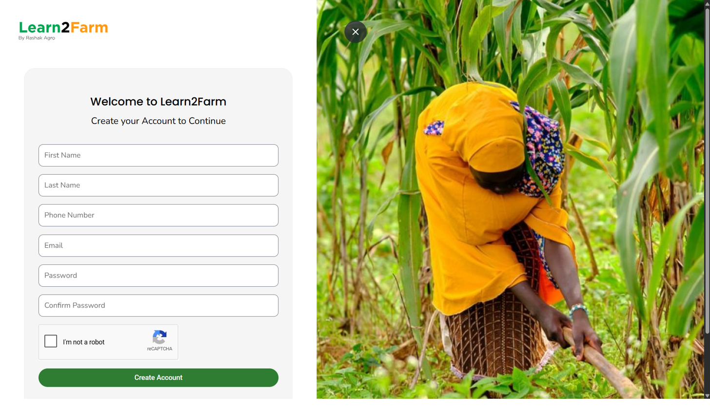
Key screens
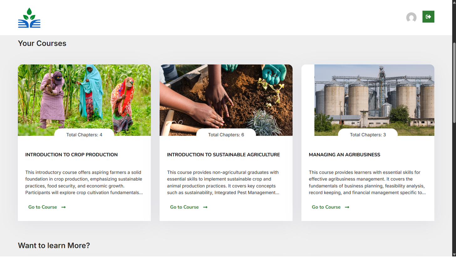
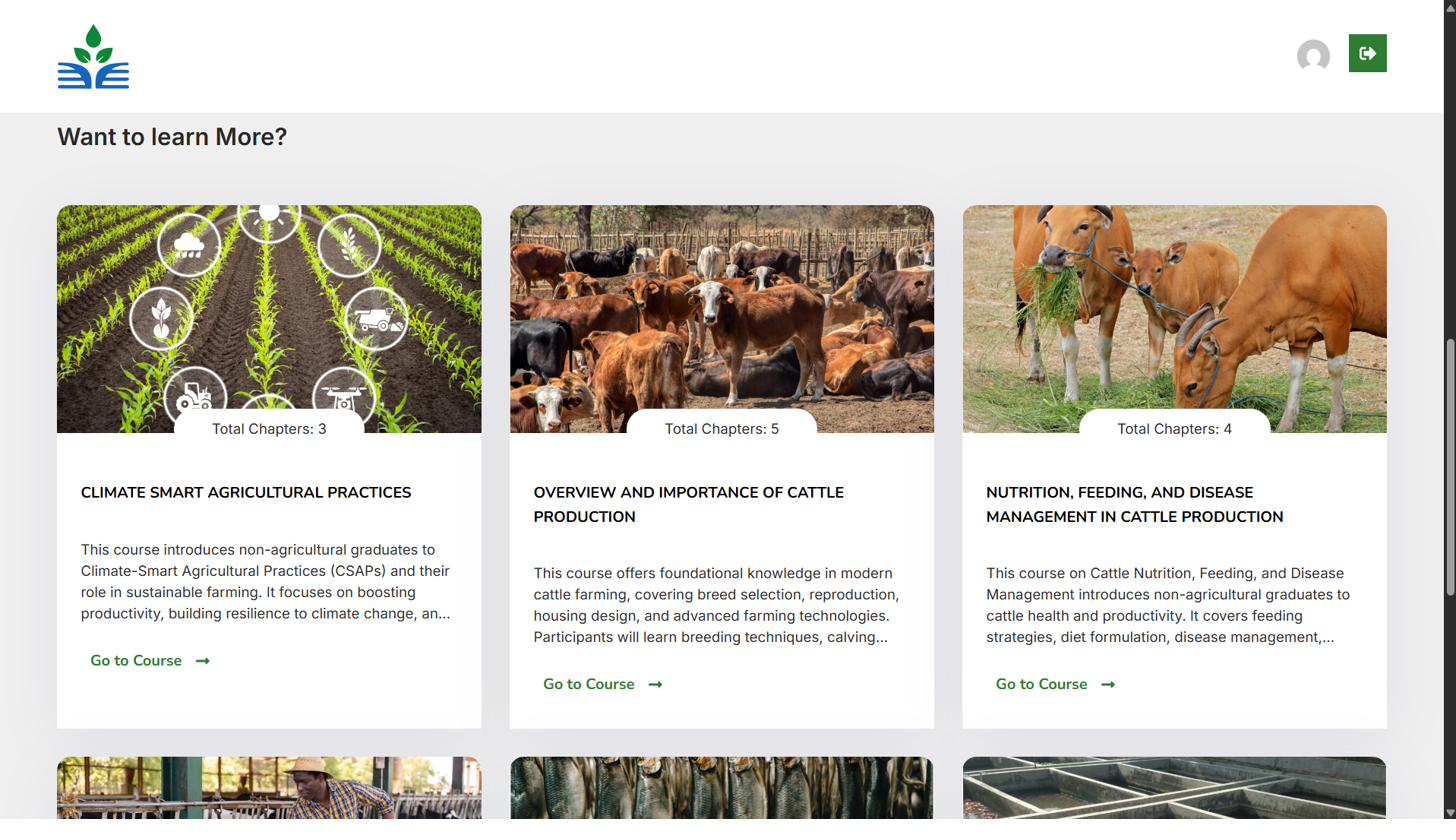
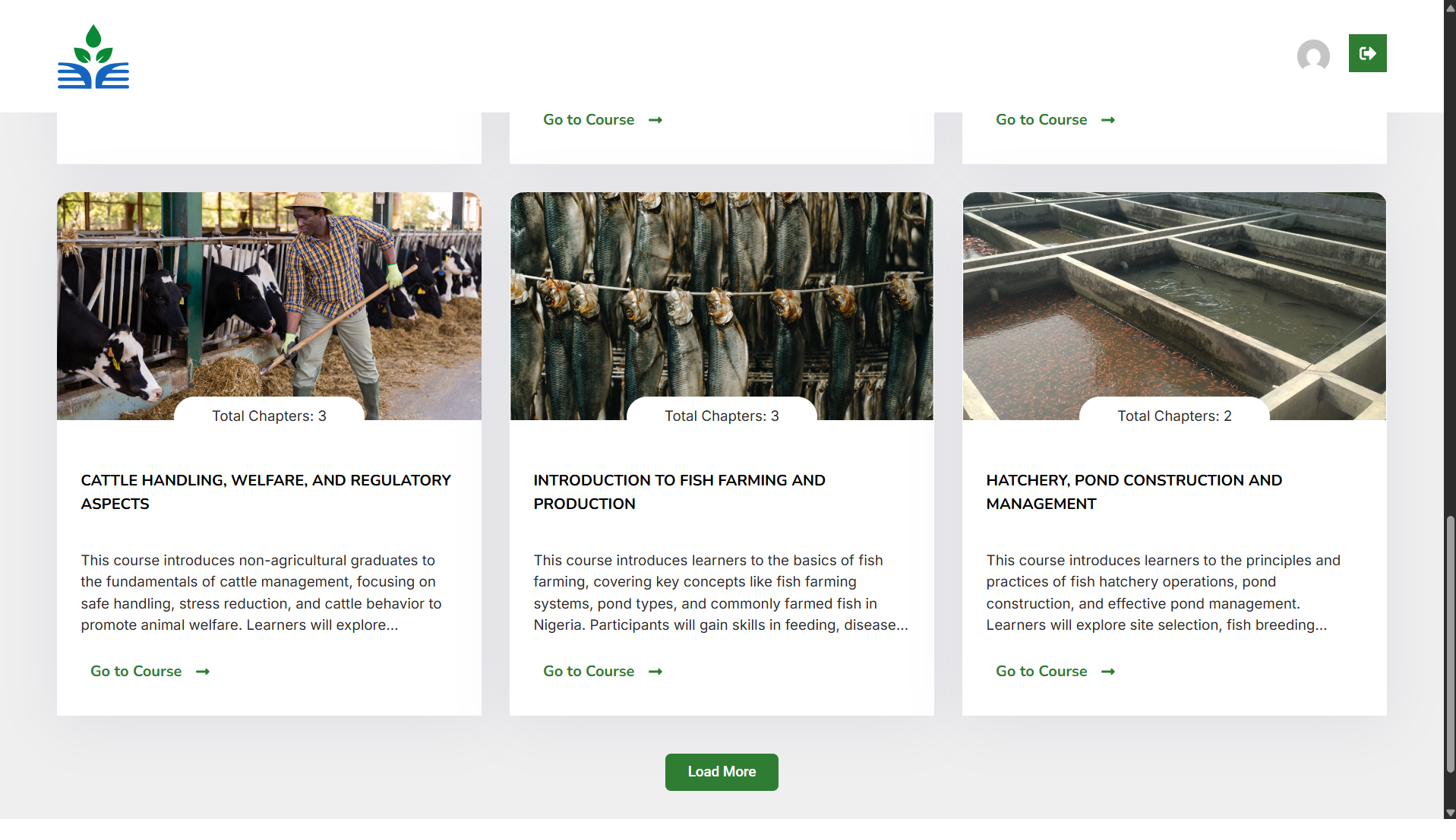

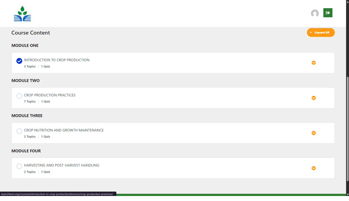
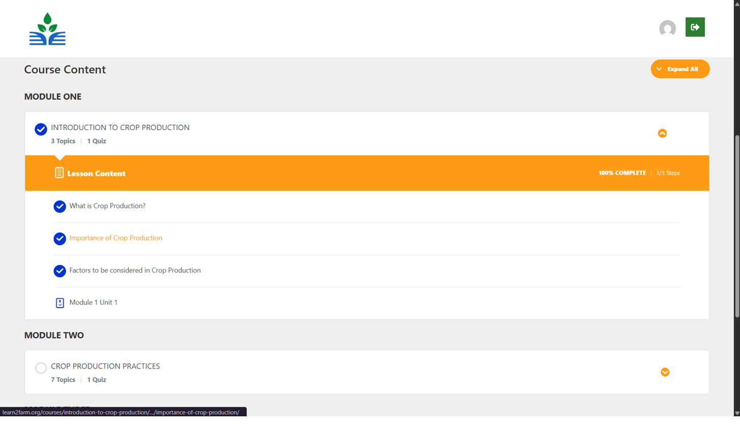
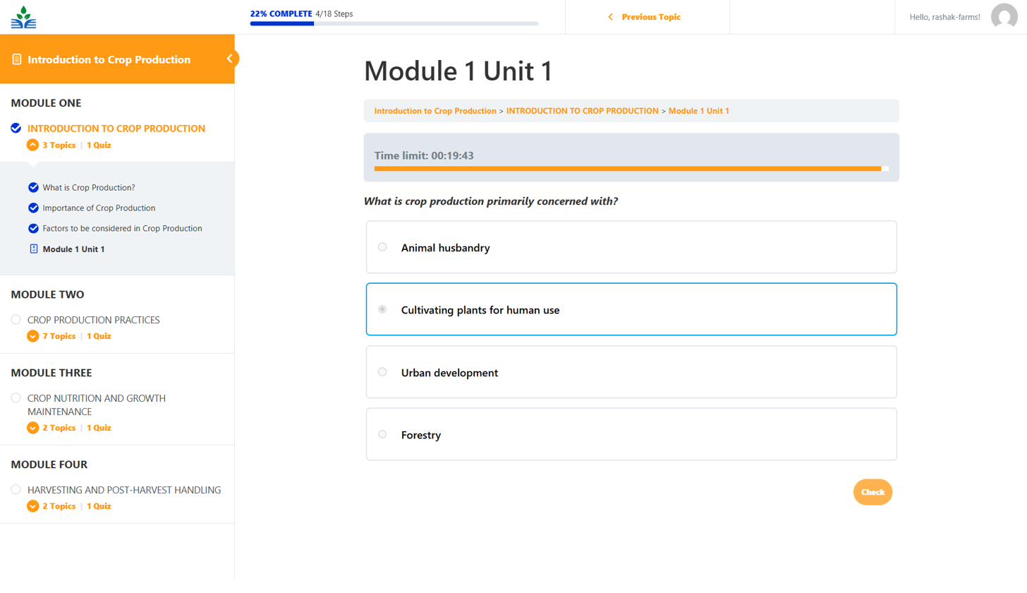
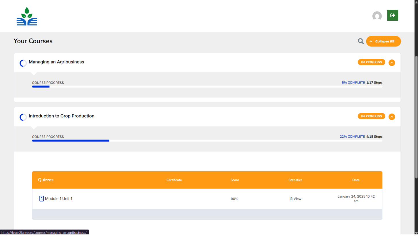
Outcome
A functional learning platform where users can create an account, browse the course catalogue, open a course overview and move through modules and units. Learners take timed quizzes to check their understanding and follow their progress and quiz scores from a personal dashboard.
See it live: visit learn2farm.org ↗VIBE+
Energy in Balance.
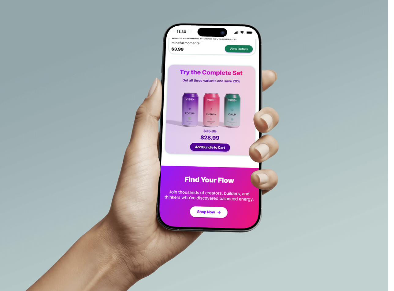
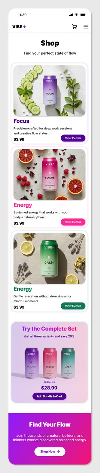
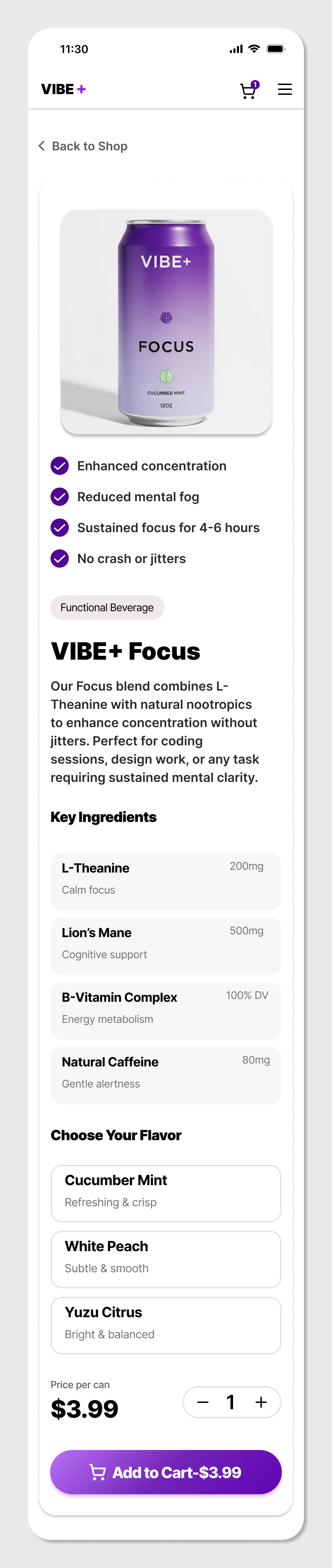
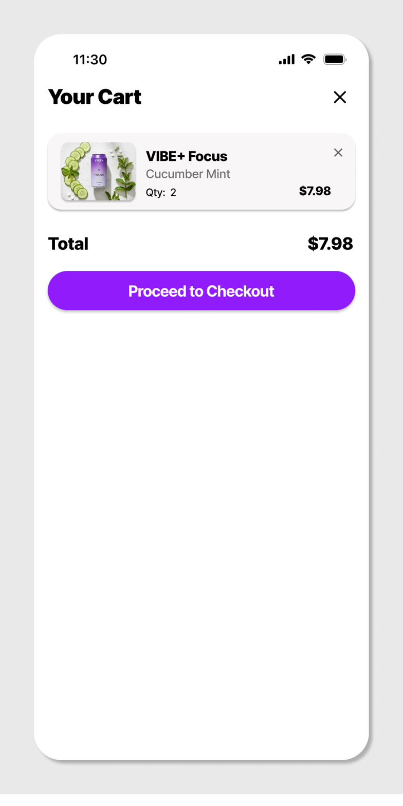
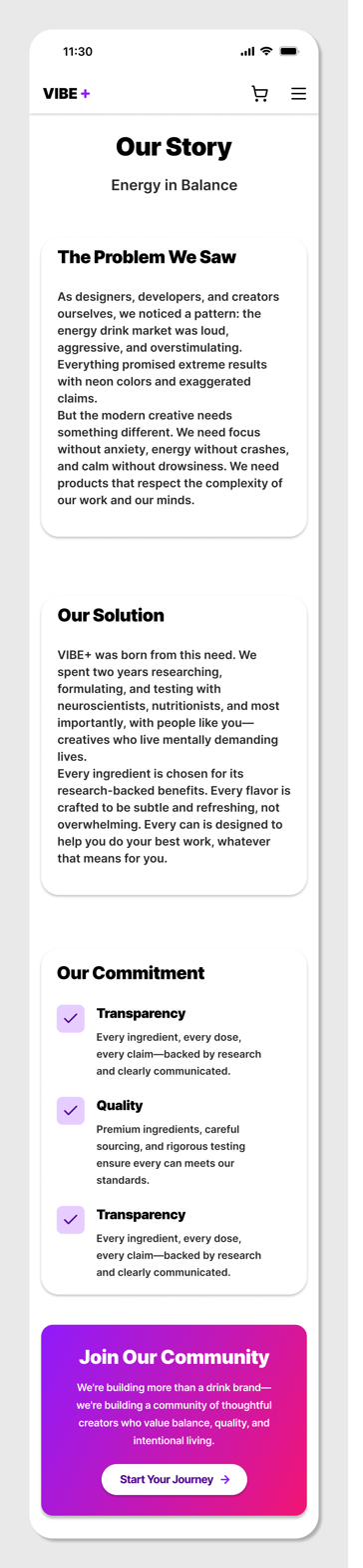
Don't just look, click through it: open the VIBE+ prototype ↗VIBE+ is a concept functional drink brand for young creatives and builders who want focus, steady energy or calm without overstimulation. I designed its mobile website around three colour-coded variants: the homepage, a shop with a bundle offer, a product page, a cart and an Our Story page.
Screens
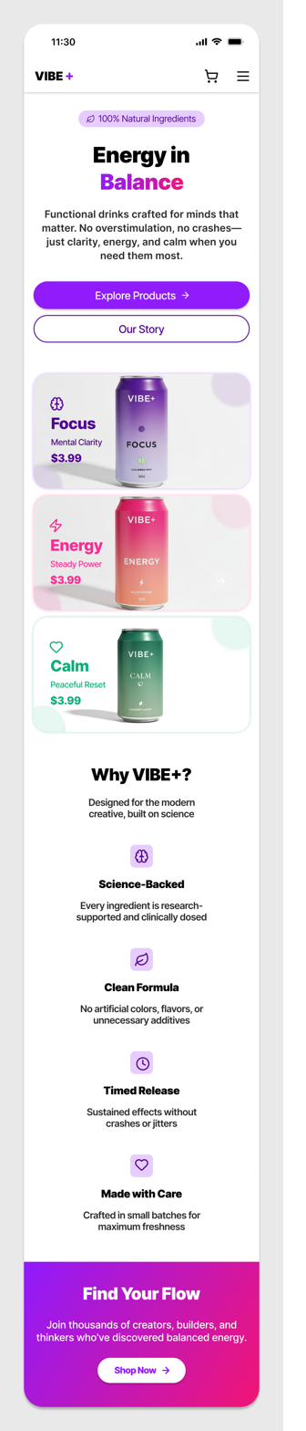
The brand
A modern functional drink brand for young creatives, builders and thinkers with mentally demanding lives. Rooted in balance, clarity and intentional energy, it offers drinks for focus, steady energy or calm, without the aggressive tone, loud visuals or exaggerated promises common in wellness.
Design highlights
Named by function
Focus, Energy and Calm tell people what each drink does, so they choose by need, not hype.
One colour each
Each variant owns a colour that carries through its card, product page and buttons.
Honest ingredients
The product page lists each ingredient with its dose and purpose instead of vague wellness claims.
A quiet interface
Light, airy pages and rounded cards leave the colourful cans to do the talking.
Decisions in one place
Flavour, quantity and price sit together on the product page, and a bundle offer rewards trying all three.
Look and feel
Calm, minimal, premium. A soft purple to pink gradient marks brand moments, headings are bold and sans-serif.
Concept project. Reviews, ingredient doses, prices and offers shown in the designs are illustrative.
LUMINO
See your day, clearly.
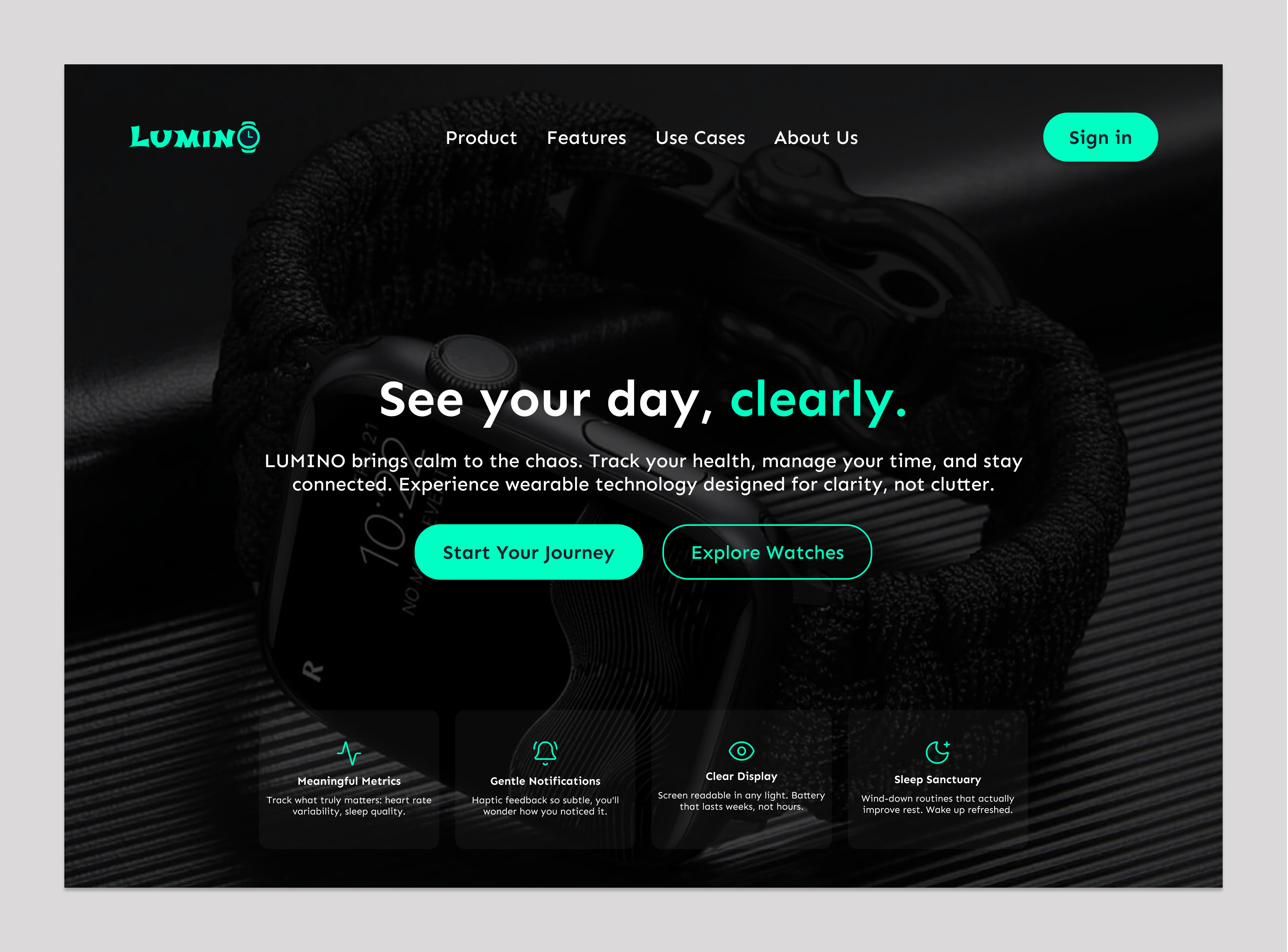
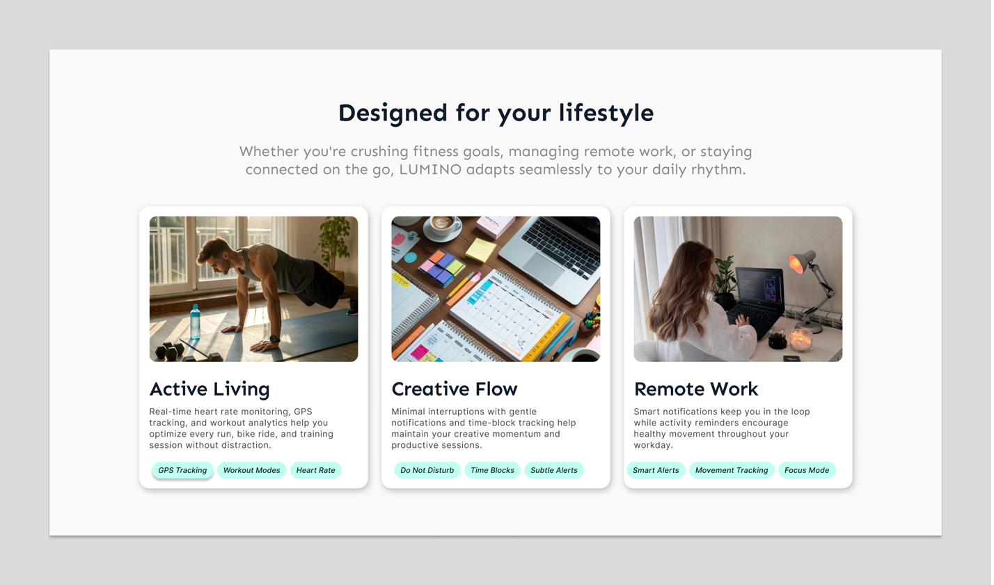
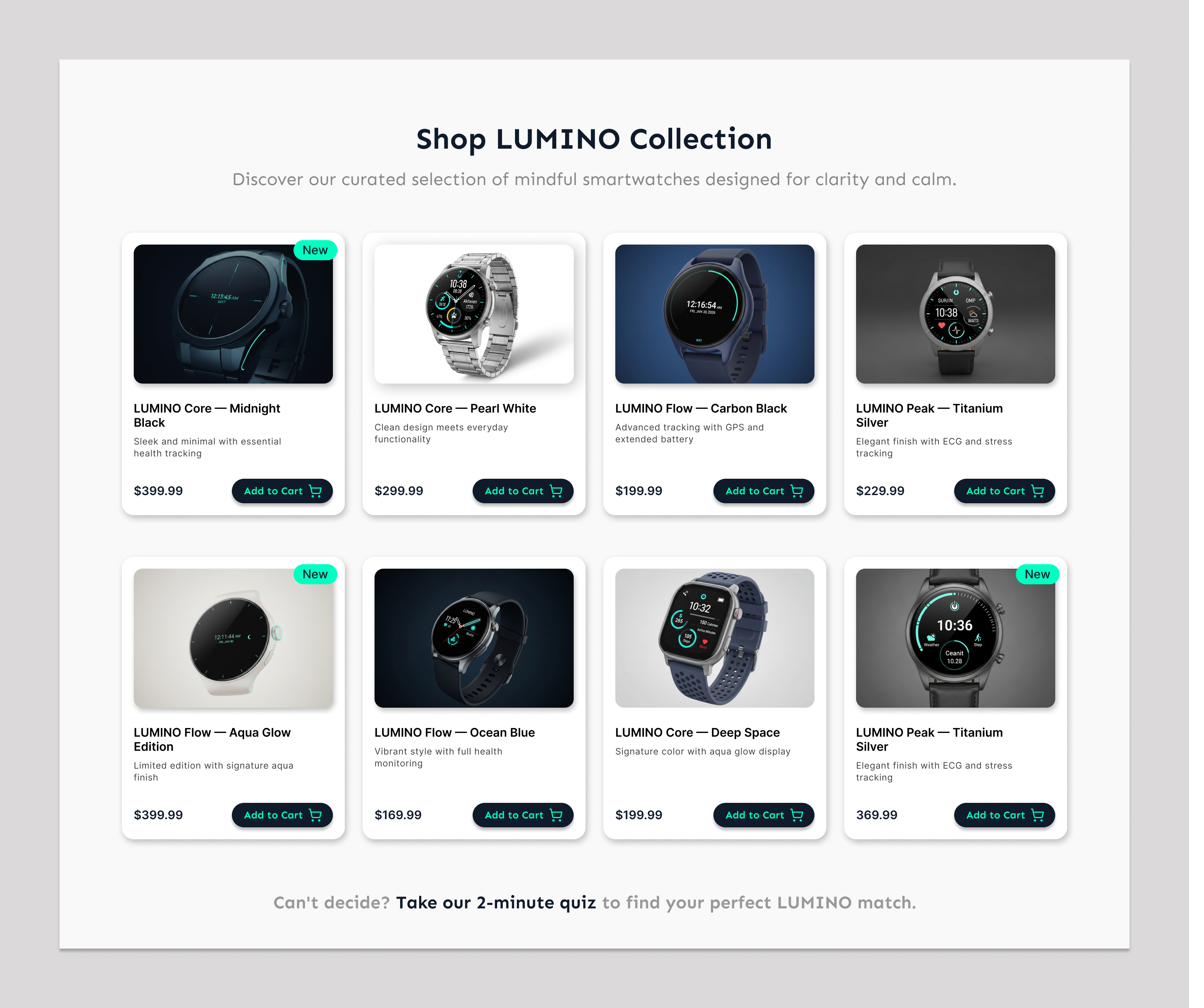
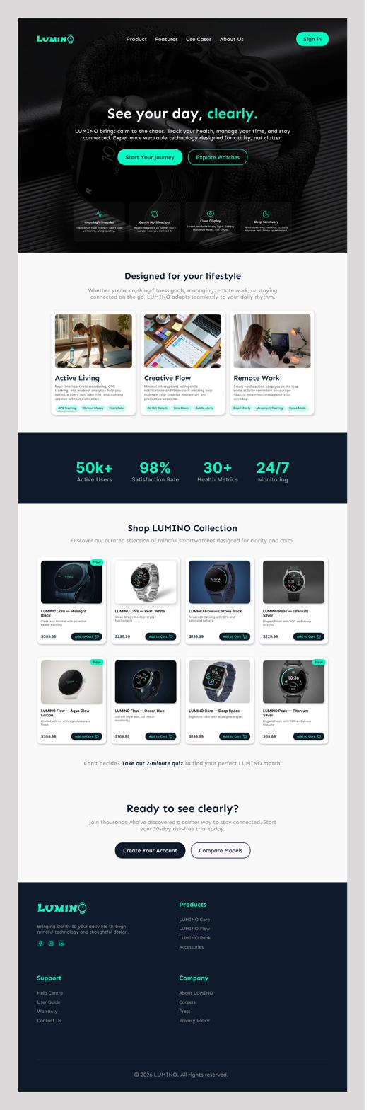
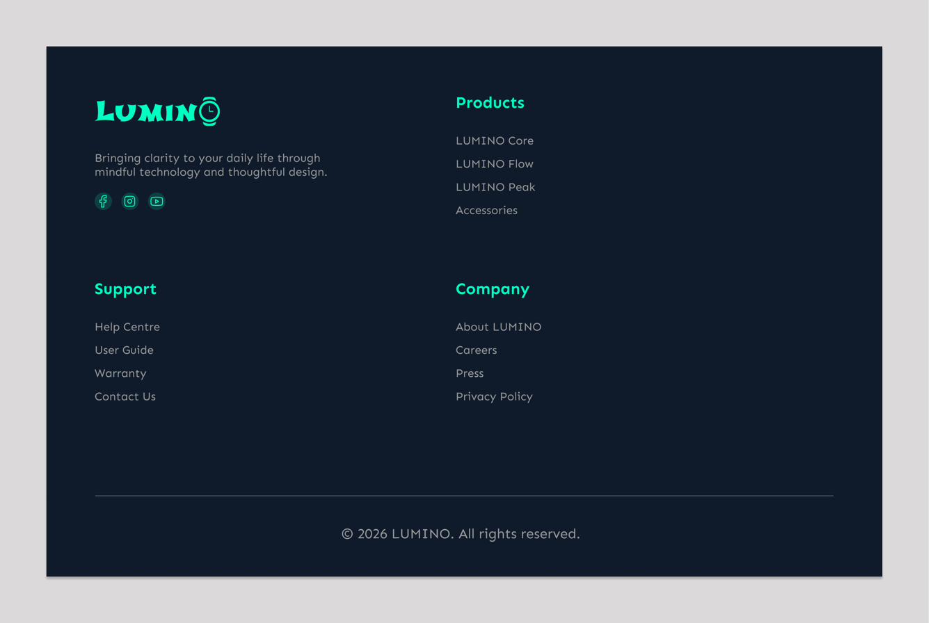
Don't just look, click through it: open the LUMINO prototype ↗LUMINO is a concept smartwatch brand for people who want health tracking, time and notifications without the overwhelm. I designed its desktop landing page and shop collection, built on a calm dark and light rhythm with a single aqua accent.
Screens
The brand
A minimalist smartwatch brand built around clarity, calm and effortless awareness. It helps people track health, time and notifications without being overwhelmed by constant alerts or unnecessary features.
Design highlights
One message up front
The hero leads with one headline, two actions and four short feature cards.
Built around real days
Active Living, Creative Flow and Remote Work show how the watch fits different routines, each with feature tags.
A shop that scans fast
Every product card repeats the same pattern: image, name, one line, price and Add to Cart, with a New badge on fresh arrivals.
Help for the undecided
A quiz prompt under the collection guides people who cannot choose.
A calm rhythm
A dark hero and footer frame light sections and a navy stats band, with aqua used sparingly.
Look and feel
Minimal, calm, dependable. Soft grey and pearl sections breathe between dark ones, and a round watch-face mark repeats in the logo.
Concept project. Product details, prices and statistics shown in the designs are illustrative.
AZZA
Money, in Flow.
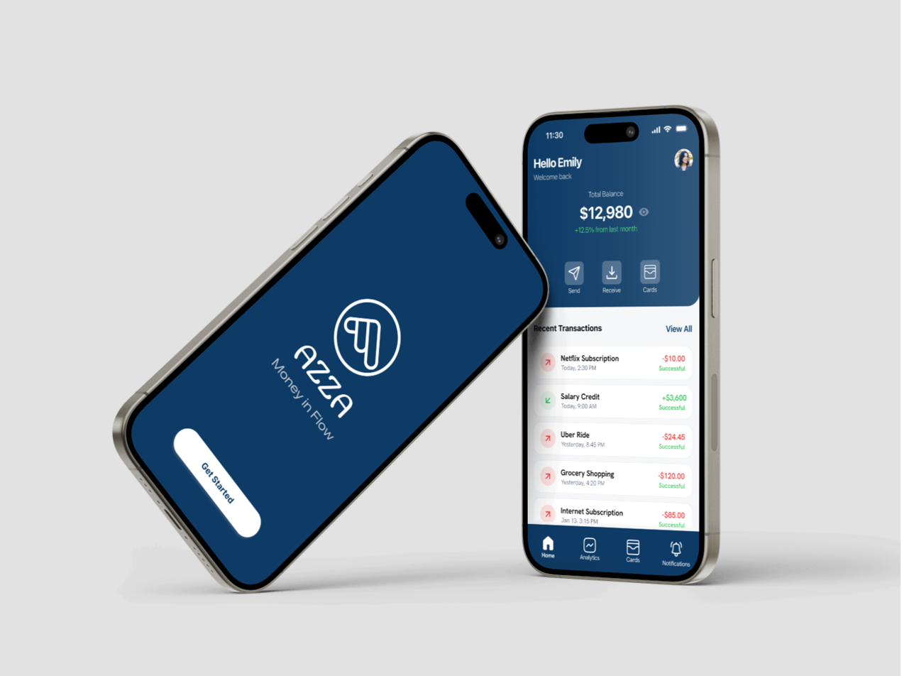
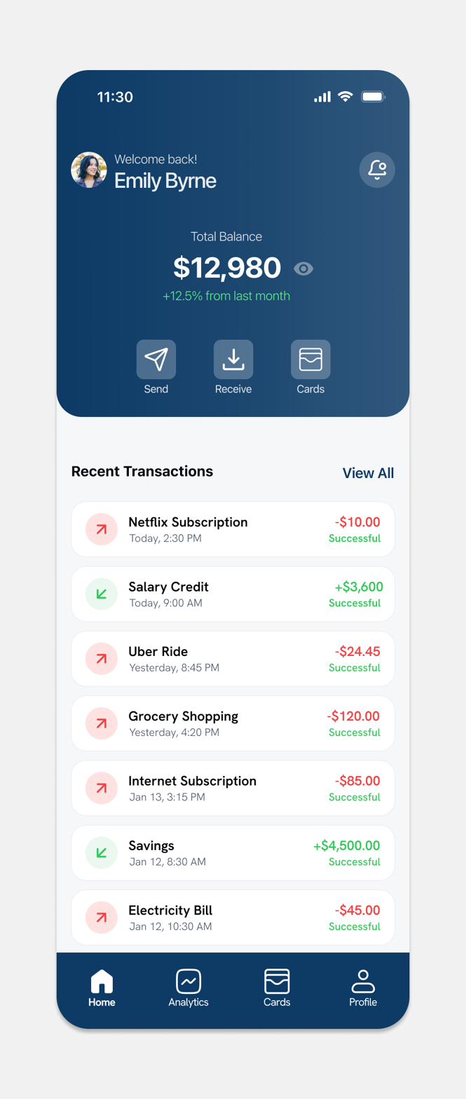
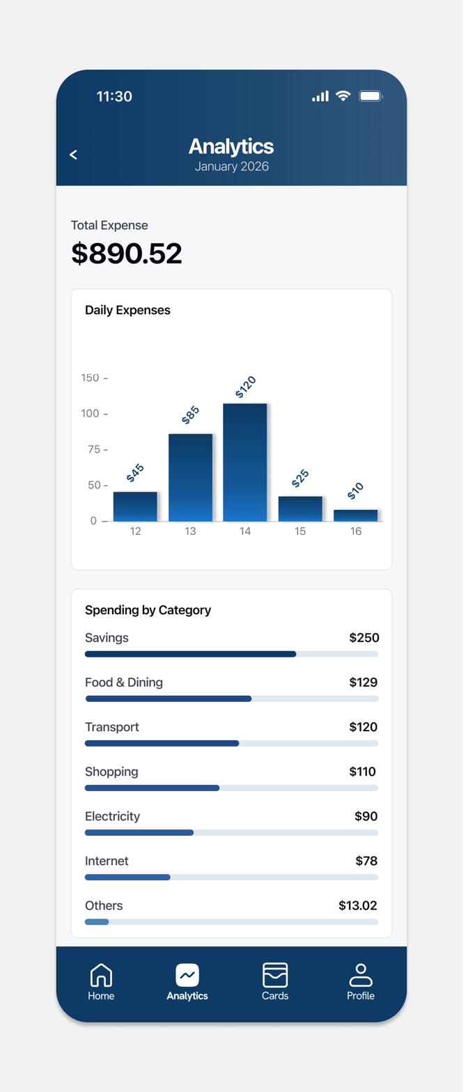
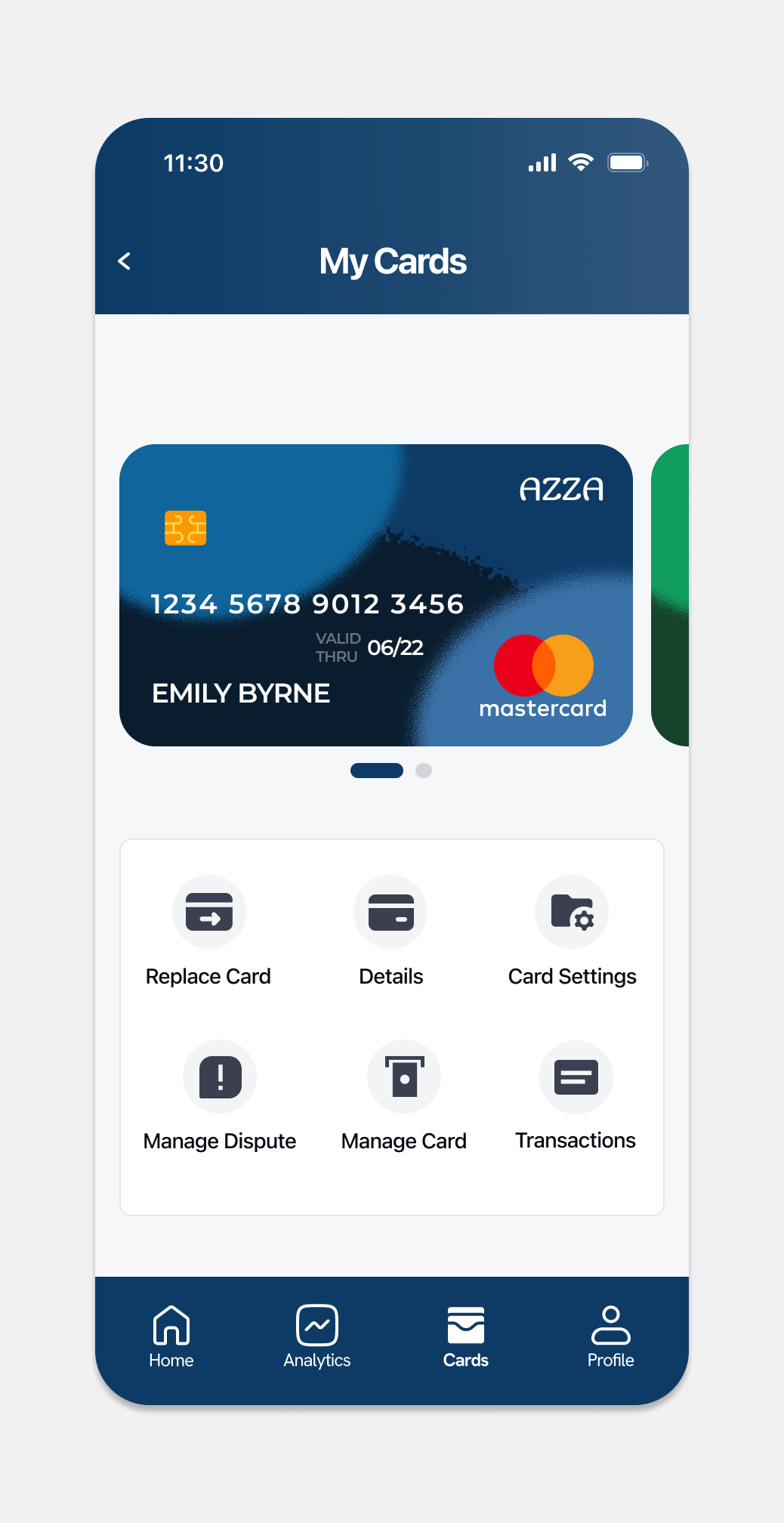
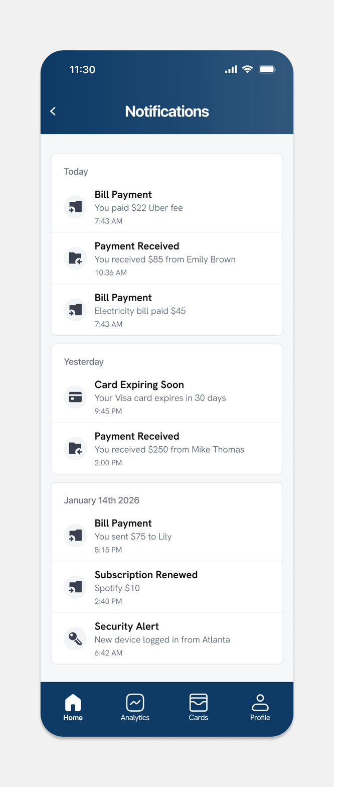
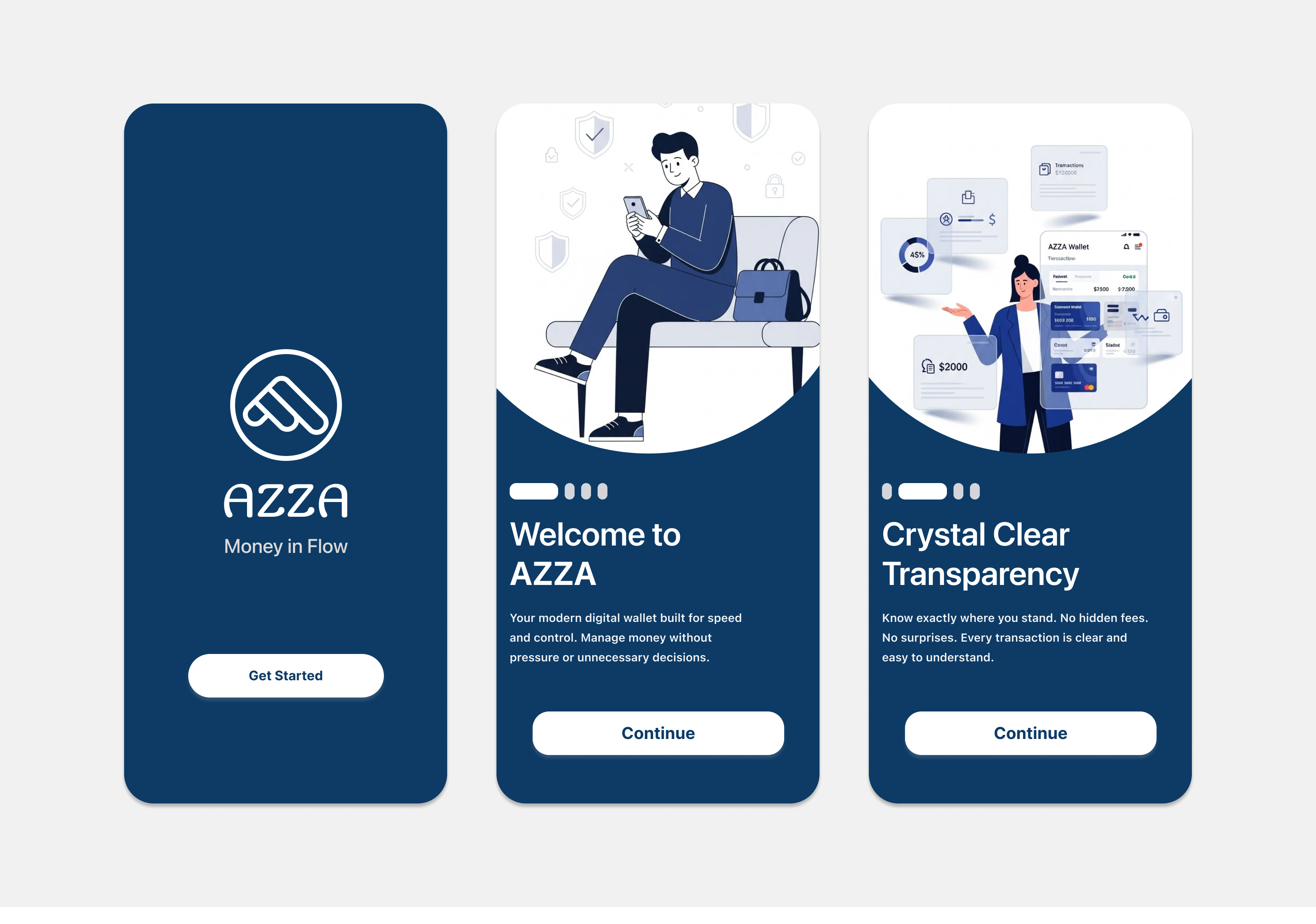
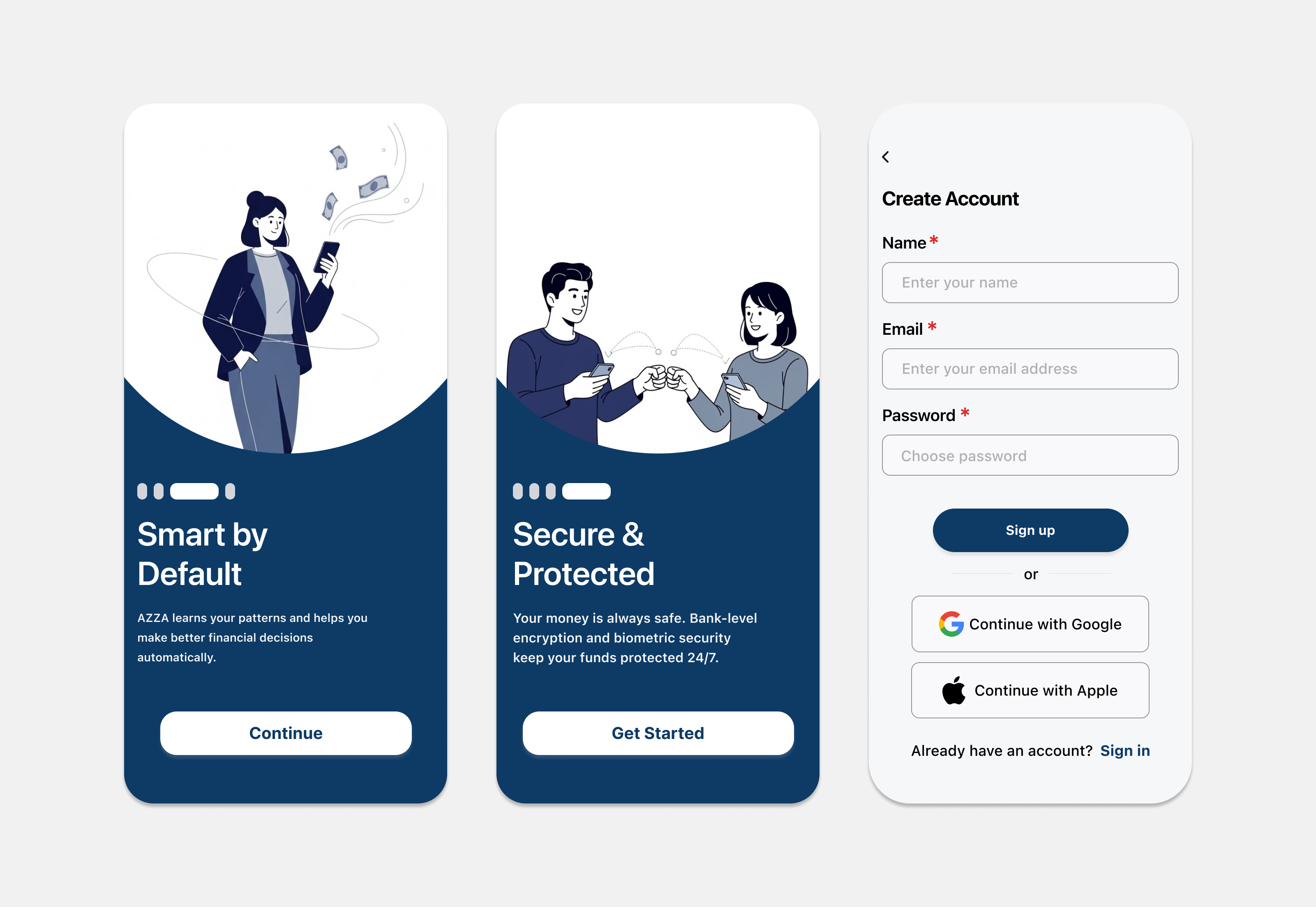
Don't just look, click through it: open the AZZA prototype ↗AZZA is a digital wallet designed for people who earn and move money online. The interface focuses on clarity, speed and control, with a calm navy and cool gray system that makes managing money feel stable and stress free. The project covers onboarding, wallet overview, analytics, card management and notifications.
Screens
The brand
Digital natives aged 18 to 35 who use wallets for daily spending, transfers and savings, and want an experience that feels stable, simple and trustworthy. Remote workers, freelancers and early-stage founders who manage personal and work finances digitally are the secondary audience.
Design highlights
Balance first
The total balance is the largest element on the home screen, with Send, Receive and Cards right under it.
Privacy built in
A visibility toggle lets people hide their balance in public.
Recognition over recall
Arrows, colour and date grouping make each transaction quick to read and trace.
Detail on demand
Home stays simple, while spending breakdowns, card controls and alerts live in their own screens.
Always a status
Every transaction shows its outcome, so users are never left guessing.
Look and feel
Calm and stable. A navy and cool gray system with white cards, green and red for money in and out, and a bottom navigation within thumb reach.